AR Contact Card
Concept, Augmented Reality project
Rich information contact card
Adobe Aero
Adobe Photoshop
Adobe XD
Overview
This is a practice project on creating AR content using Adobe Aero on the iPad.
Problem
Regular contact/business cards can only fit a small amount of info, and the users will have to manually go through some steps if they want to contact that person.
Goal
To create a seamless experience in viewing a person’s information and easily contacting them.
My Role
Create an interface design and implement it in the AR app.
Wireframes
I believe that designs should always start with some wireframes on paper in order to quickly check what it would look like and which part does not make sense to put in a design. And then work on the low and high fidelities for the mockups.
Paper wireframes for AR Contact Card.
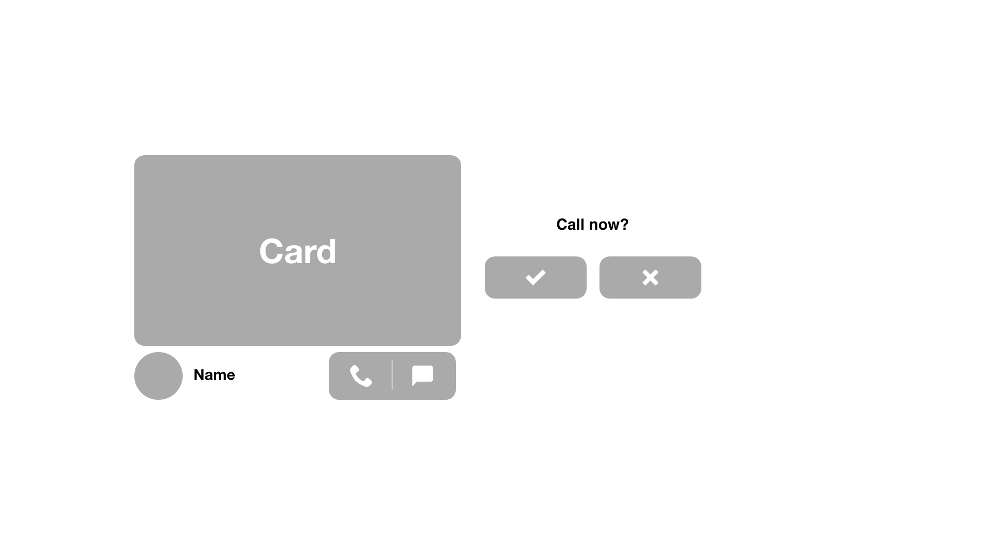
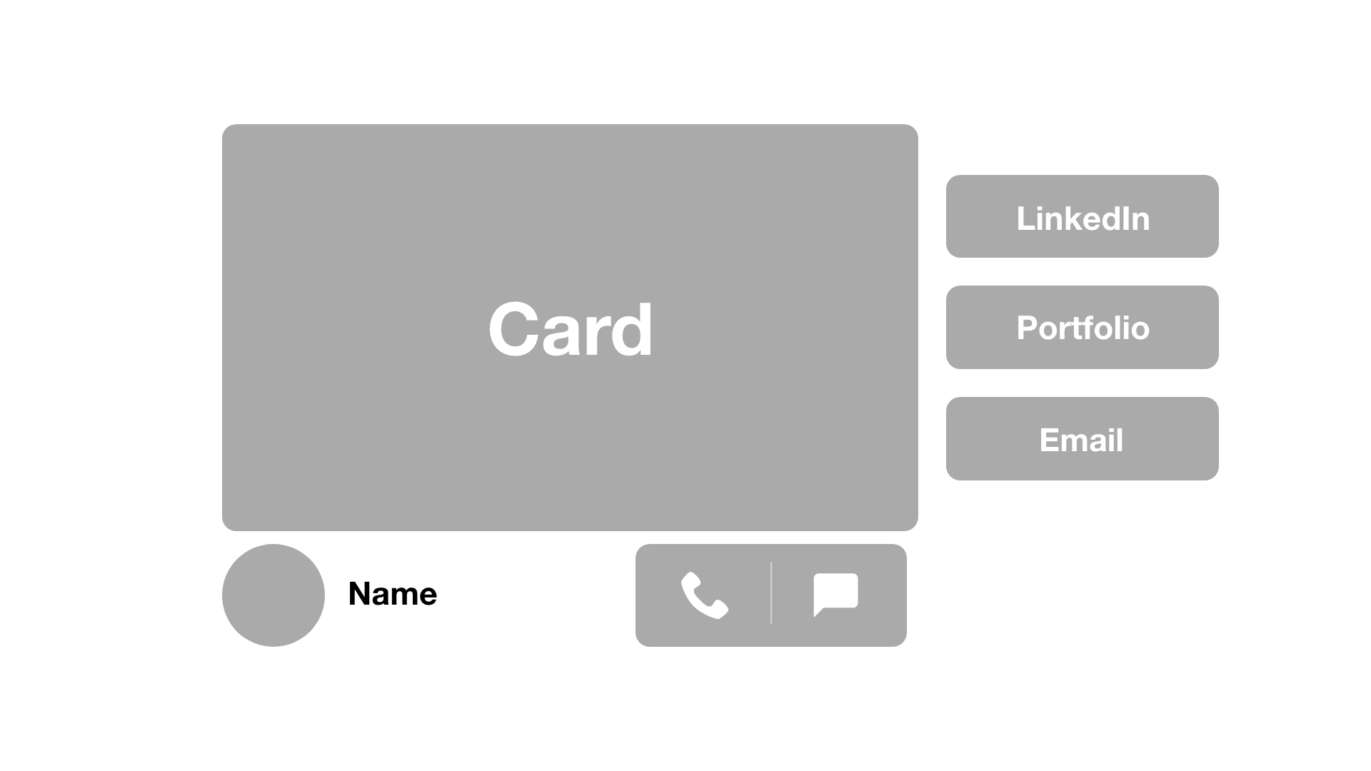
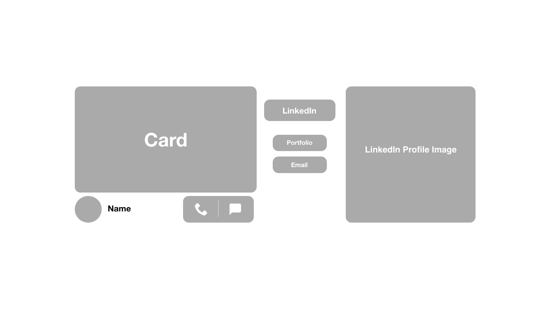
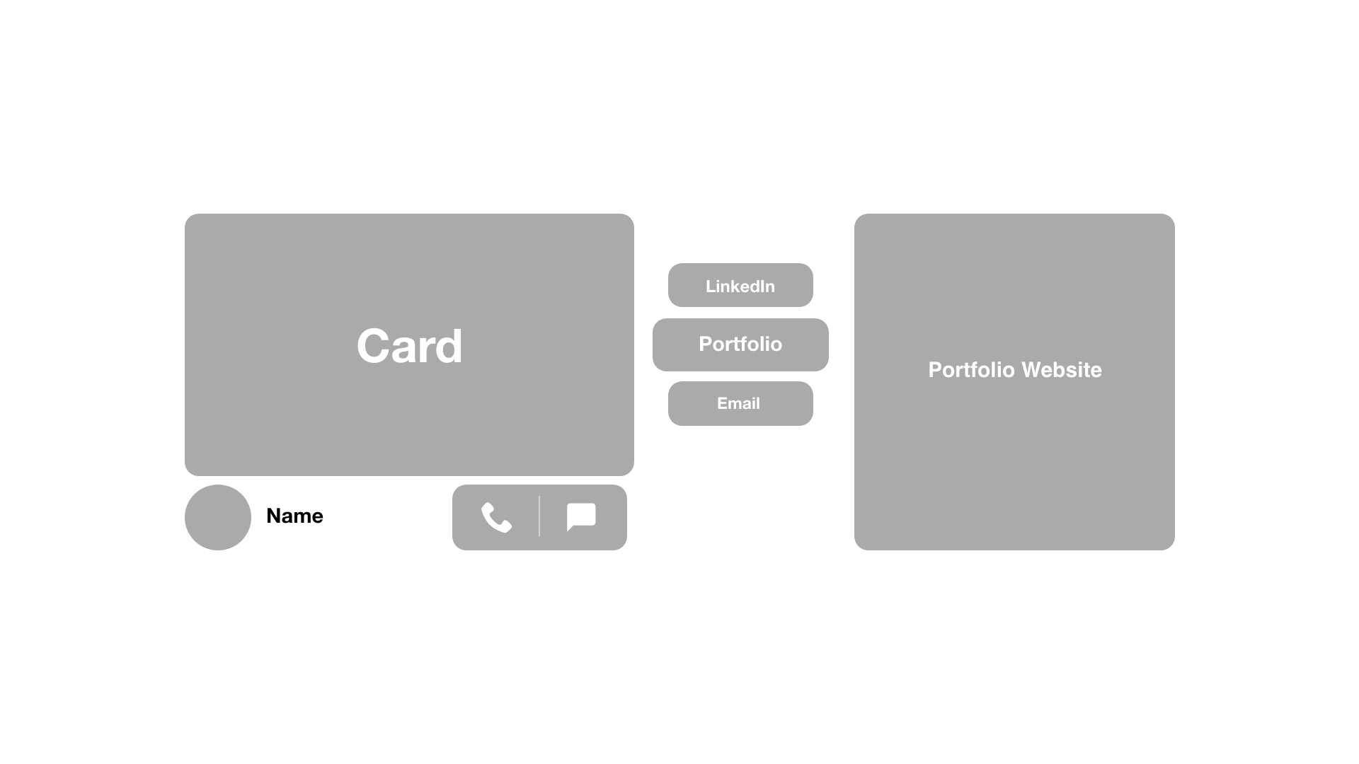
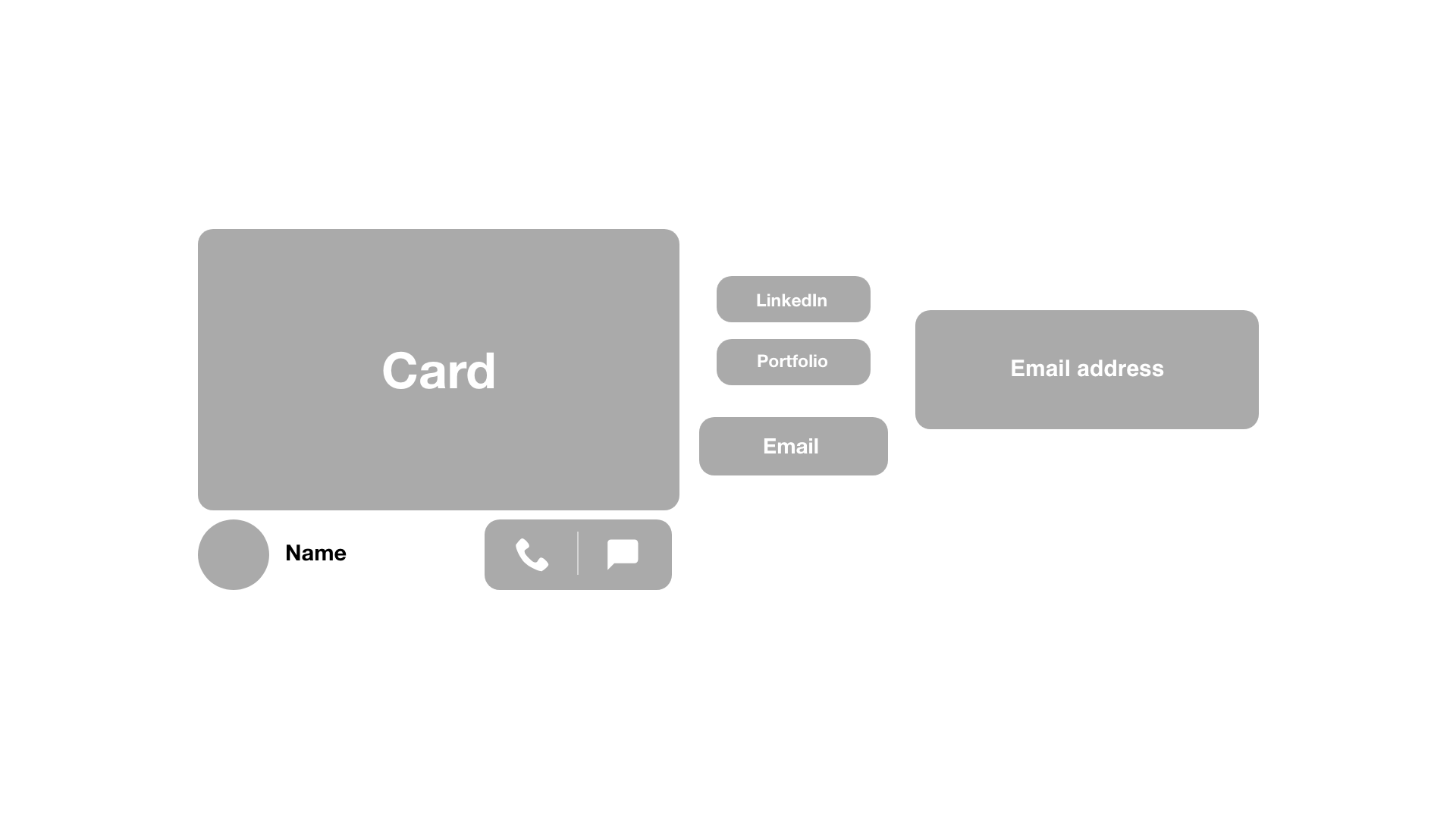
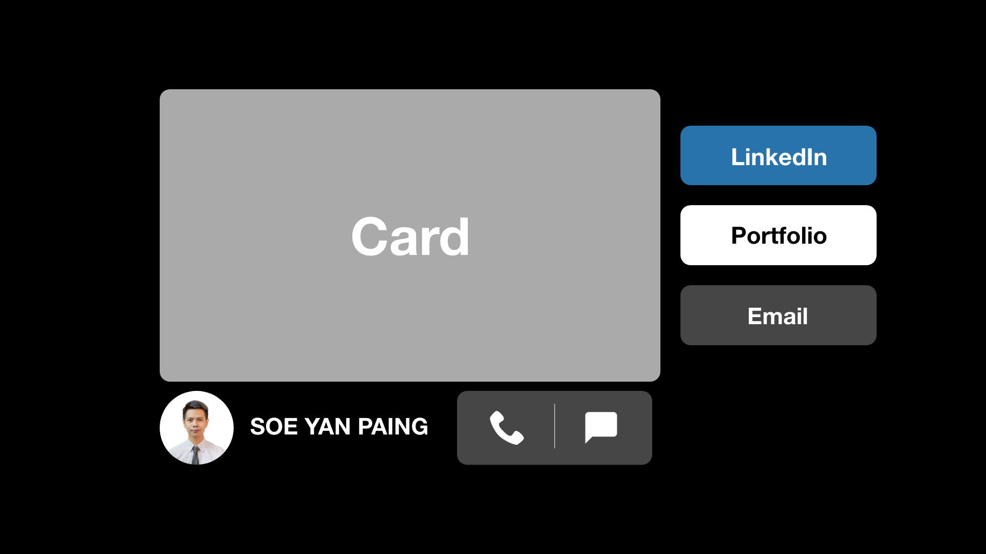
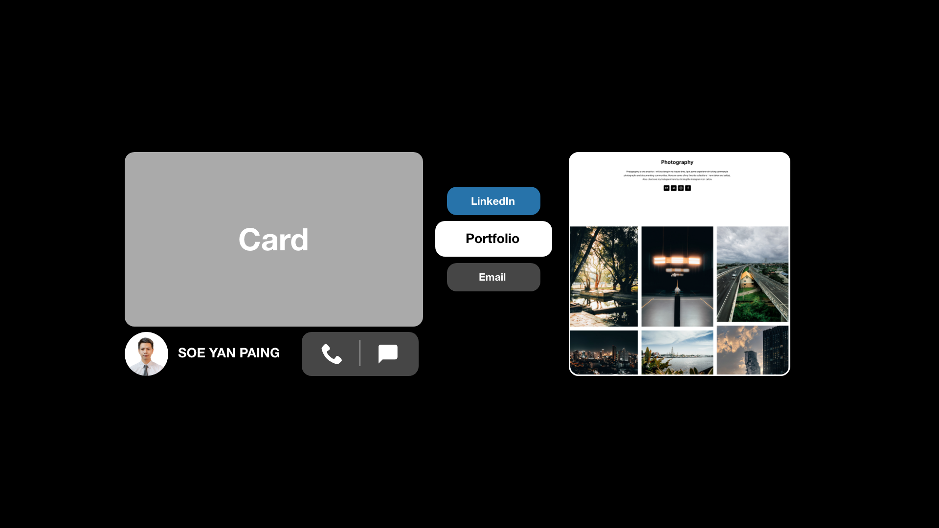
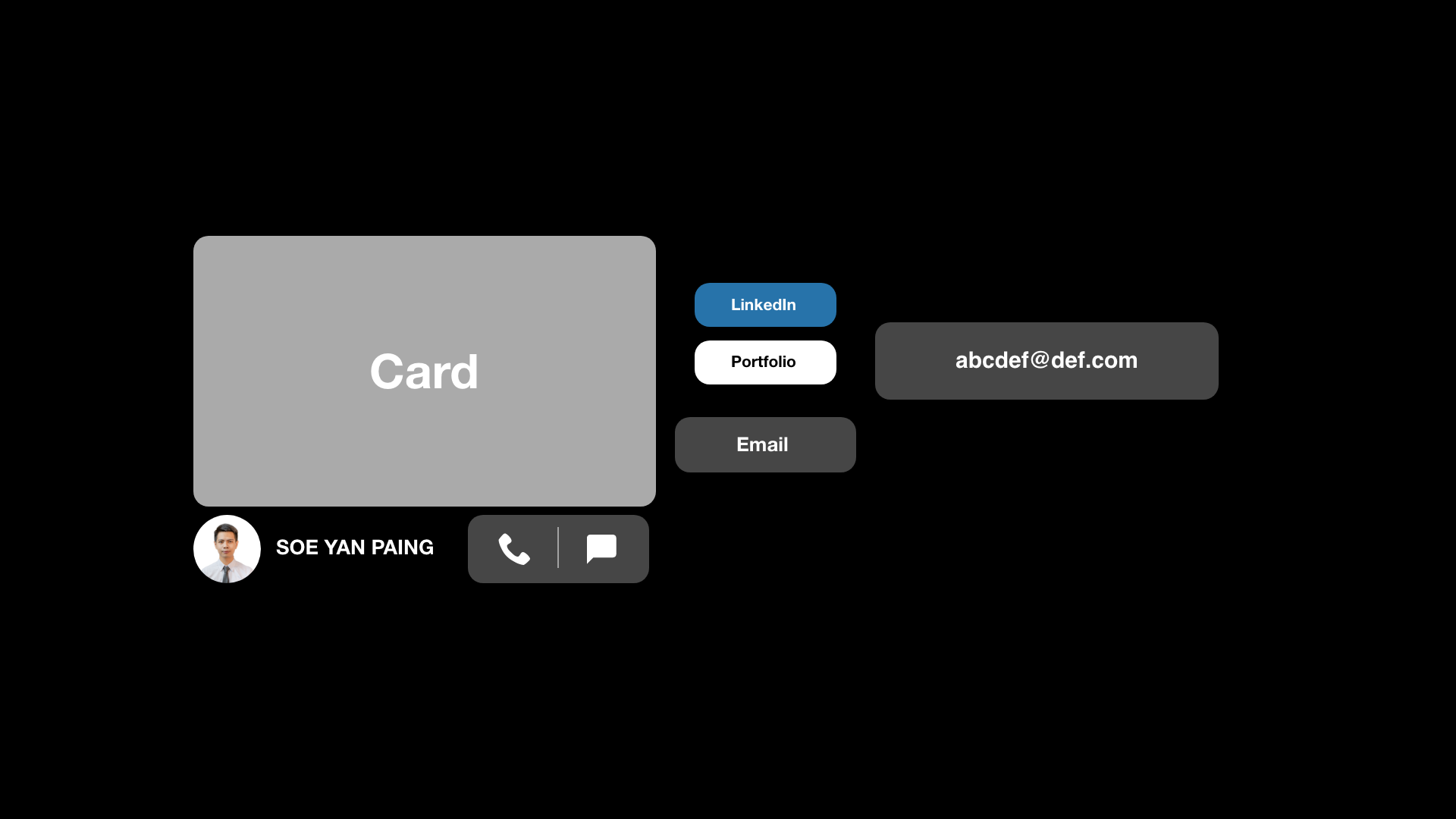
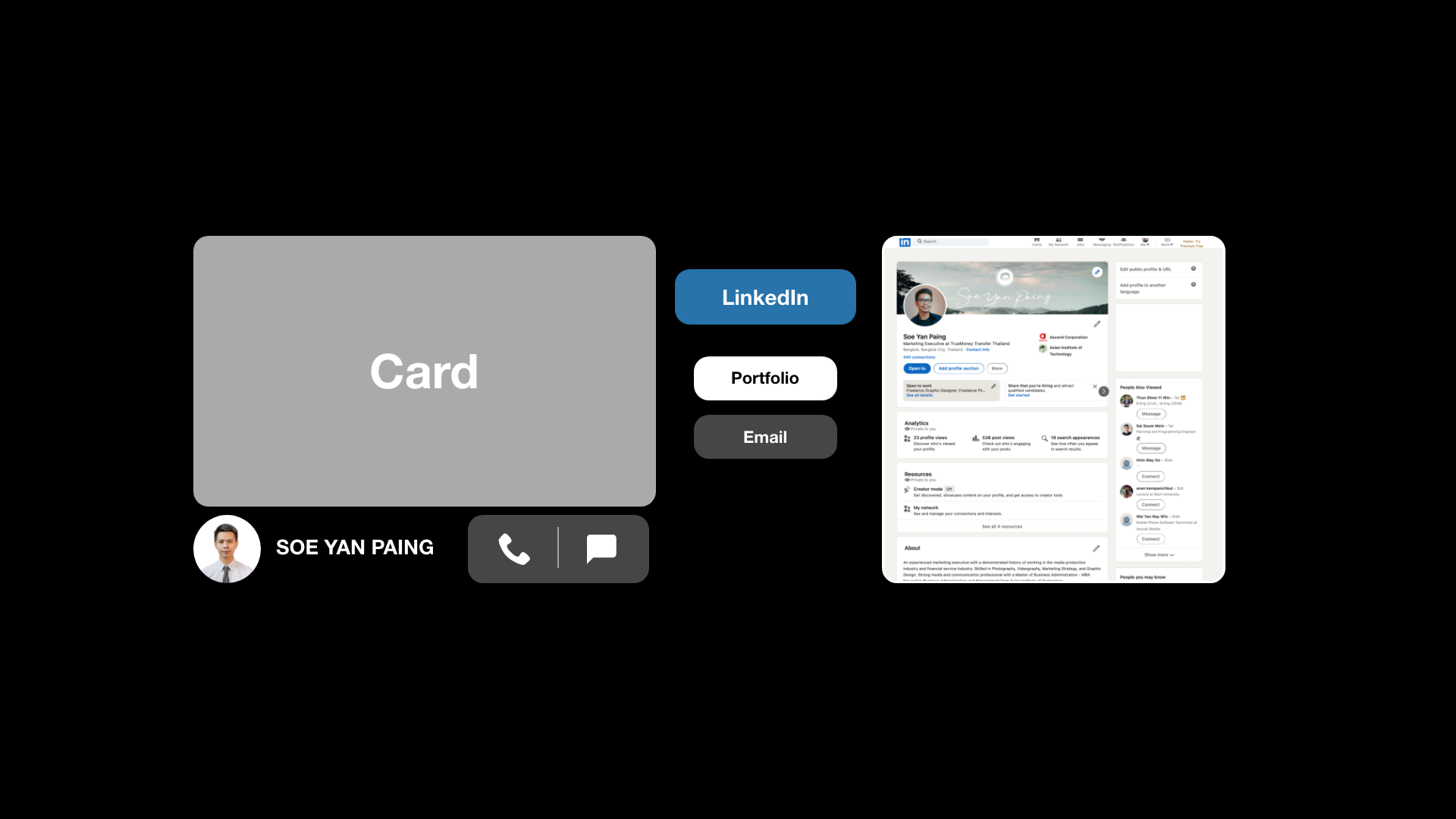
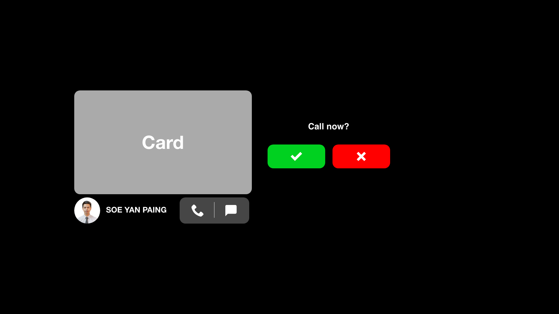
Trying out in Adobe Aero iPad app.
The below videos are some of the attempts I made during the implementation.
Since it was my first time using the app, it was really frustrating.
It didn’t go as I wanted, but after some tries, at least it reached the stage that I was imagining in the mockup.
1st attempt just after learning how to use Aero on iPad.
2nd attempt, after learning how the behaviour feature works.
3rd/ Final attempt, after optimizing all the animations.
What I learned
Creating AR is fun and feels awesome if the intended behaviors work. Even while placing the design and arranging, I mistakenly thought and tapped buttons on the table, which is telling me that our brain thinks it's a real thing, and that’s weird because I am using my own design here. Why was I trying to hit the buttons and touch the interfaces?
I have to learn so much more about this, as these are going to be common in the future meterverse anyway. For us, designers, we should be trying out new ways to implement these features in people’s daily lives for the better.


